Libro — Structuring Digital Reading
Clarity and social motivation for book lovers
Developed during my UI/UX bootcamp at SuperCode as my first project in Figma. In this group project, we created Libro, a conceptual reading app for structured digital reading with personalized reading lists, progress tracking, and a community that inspires people to read.
Screens
High-fidelity mockups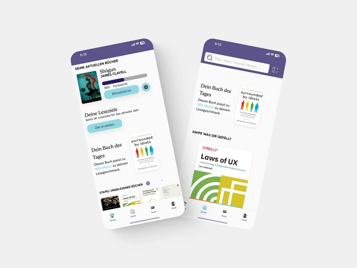
The Problem
Digital reading is often fragmented. Between e-books, articles, and PDFs, it's easy to lose track. Existing apps focus on purchasing, not on the reading experience itself. Readers are looking for a central platform that combines organization and social motivation.
Target Audience
Book lovers aged 20-40 who read regularly and want to structure their reading habits. They value clear overviews, progress visualization, and exchange with like-minded people.
Process
- 01
Research
User interviews, competitor analysis, user needs
- 02
Ideation
User flows, information architecture, wireframes
- 03
Design
Visual design, design system, high-fidelity prototype
- 04
Testing
Usability testing, iterations, feedback integration
Research Insights
- 1
Readers want a central overview of all reading materials
- 2
Progress visualization motivates continued reading
- 3
Social component increases reading discipline and discovery
- 4
Clear categorization reduces decision fatigue
- 5
Minimalist design helps focus on the text
Competitor Analysis
Analysis of Goodreads, StoryGraph, and Apple Books. Insight: Existing solutions are either too complex (Goodreads) or too isolated (Apple Books). A combination of clear design and community is missing.
Value Proposition
Libro combines clear reading lists, visual progress, and community features in a minimalist app that puts focus on reading.
Solution – Core Features
Smart Reading Lists
Organize books, articles, and PDFs in personalized lists with tags and categories.
Progress Tracking
Visual representation of reading progress with statistics and reading goals.
Reading Community
Share reading progress, discover recommendations, and connect with other readers.
Focus Mode
Minimalist reading view without distractions – for maximum concentration.
Design System
A consistent design system with warm color tones that associate reading with coziness. Clear typography for optimal readability and intuitive navigation.
Colors
Warm orange as accent color, neutral base tones for content area
Typography
Readable sans-serif fonts with clear hierarchies
Components
Reusable UI components for consistent user experience
Impact & Learnings
Libro was my first independent UX/UI project and taught me the importance of thorough research phases. Usability tests revealed that users value speed – this led to a simplified navigation.
"Good design for readers begins with understanding how people read today."
More Projects
Discuss the project?
I'm happy about feedback and exchange.